DTP / Art Direction / Layout

DESCRIPTION
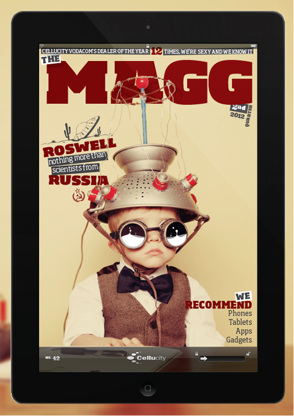
The MAGG had a style that made people laugh & informed them at the same time. Together we sourced stories
& developed a look and feel that made it something people wanted read.
When
January 2009 - December 2012
Who
Ricardo c dos Santos (Art Director), Barry Tyson ( Editor)
Situated in the center a the city bowl, in a studio we played music all day ranging from 60’s through to the most recent of offerings … and we also worked on the MAGG.

We had developed a style that made people laugh & informed them at the same time.
Together we sourced stories & developed a look and feel that made it something people wanted read. 40,000 copies of the magazines were distributed nationwide, every second month, through 20 retail outlets based in the country’s premier shopping centres.
It was a 36-page full-colour publication contained all the information about what was new at the time to tech, with specific sections on: Gaming, Accessories, Phones and Contract deals.

A masthead is a very important element to a magazine and we developed this through time the original for the MAGG incorporated the older Cellucity logo elements but having to create an identity of its own yet seeming techie, we opted for the cleaner heavier text that gave it a clean friendly look.


below you'll find the layout and the look and feel of the magazine...


layout and feel discussed over a couple goods songs...


News section sourced by the editor and myself...

I have copies available, if you would like to look at the overall magazine.
Who knows maybe you have an idea for a publication that can be printed and digitally modified for mobile application?

grow your business with me
Usually a quick reply,
As you grow I grow. That means we grow
lets do this